The Converters
The Converters Branding Project

For this project we were tasked with designing a logo for a band called The Converters. The Logo design was to have the specifications of being for a 20-60 year old, biker, classic rock, blues demographic and be reminiscent of the Guns N’ Roses logo and resemble a tattoo. The information provided was very specific and helped our design decisions to create the best possible image to encompass all of those attributes.
Sketches
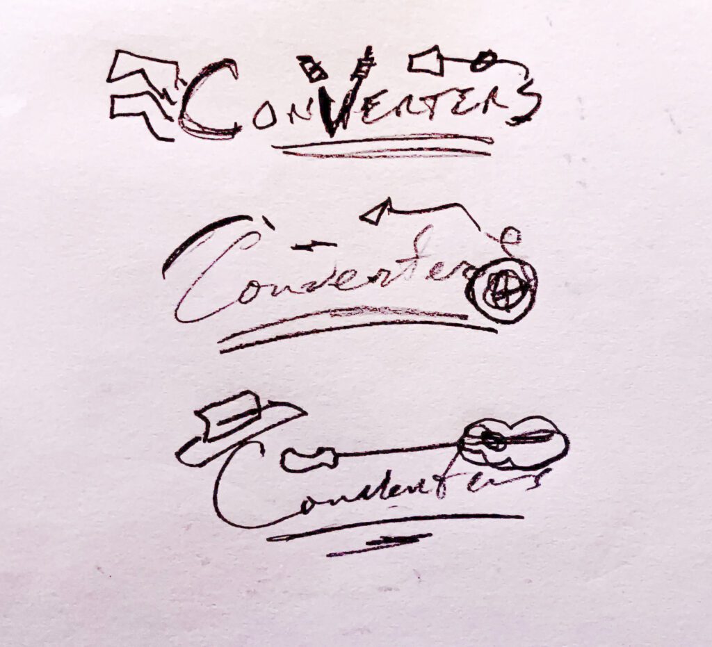
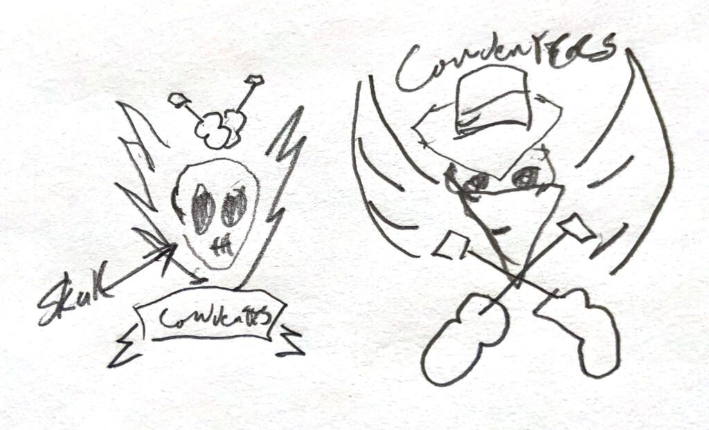
As you can see the sketches were very rough. These were just used as a way to put our thoughts onto paper, and give us a good starting point for the design in Illustrator. The instructions on what the logo should look like were so specific that we already had a good idea of the direction we would be heading.
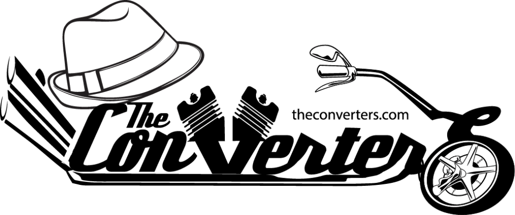
This is Version one of the logo. The idea behind it was to “convert” the band name into a motorcycle as a play on words. The fedora was added to give it that blues vibe.
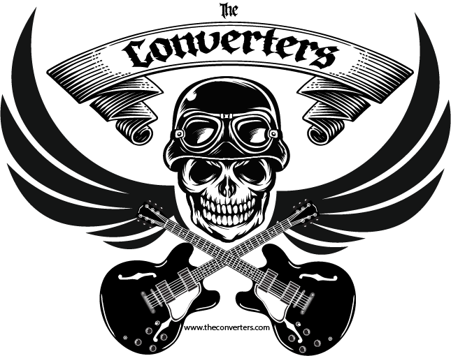
Here is version two of the logo. We went with something more akin to what you may find as a tattoo or a patch on a biker’s leather vest. We used the skull with the “brain bucket” to represent the bikers and the guitars were crossed to represent music and give the skull a “Jolly Roger” feel. We used a vintage font with the ornamental ribbon which has rock vibes. These were good starting points, but after review we decide to rework version 2 to better encompass what the client was asking for.
The Invoice
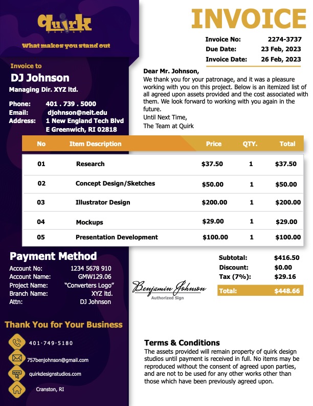
Everybody loves payday, so for the next part of this project we were tasked with creating an invoice for the two logo variations we had completed so far. The goal of this was to ensure that we had properly logged our hours spent on the design, as well as, design an aesthetically pleasing invoice. We wanted it to be something that also had a solid design and not just a simple black and white statement that has the total amount due. The idea was that the client would enjoy looking at it even though they had to pay for the services provided. Hoipefully that would take some of the sting out of the final cost.
Logo Re-Work
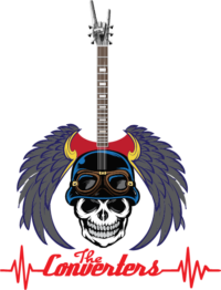
Here are the new versions of the logo both ib black and white and in color. We decided to change the wings so that they had more depth rather than just being a flat black. Also the negative space created by the wings now forms a guitar, to which the neck and guitar head were added. We wanted to give it more of a rock vibe, and make sure that the viewer knew immediately that it was associated with music. The color choice is inspired by the “American Traditional” tattoo style that has bright vibrant primary colors.
Mockups
For the next phase of the project, it was time to create some mockups using the new logo. I find that the best way to tell if a logo is truly working is to put it on something, and ask myself: “Would I buy that?”
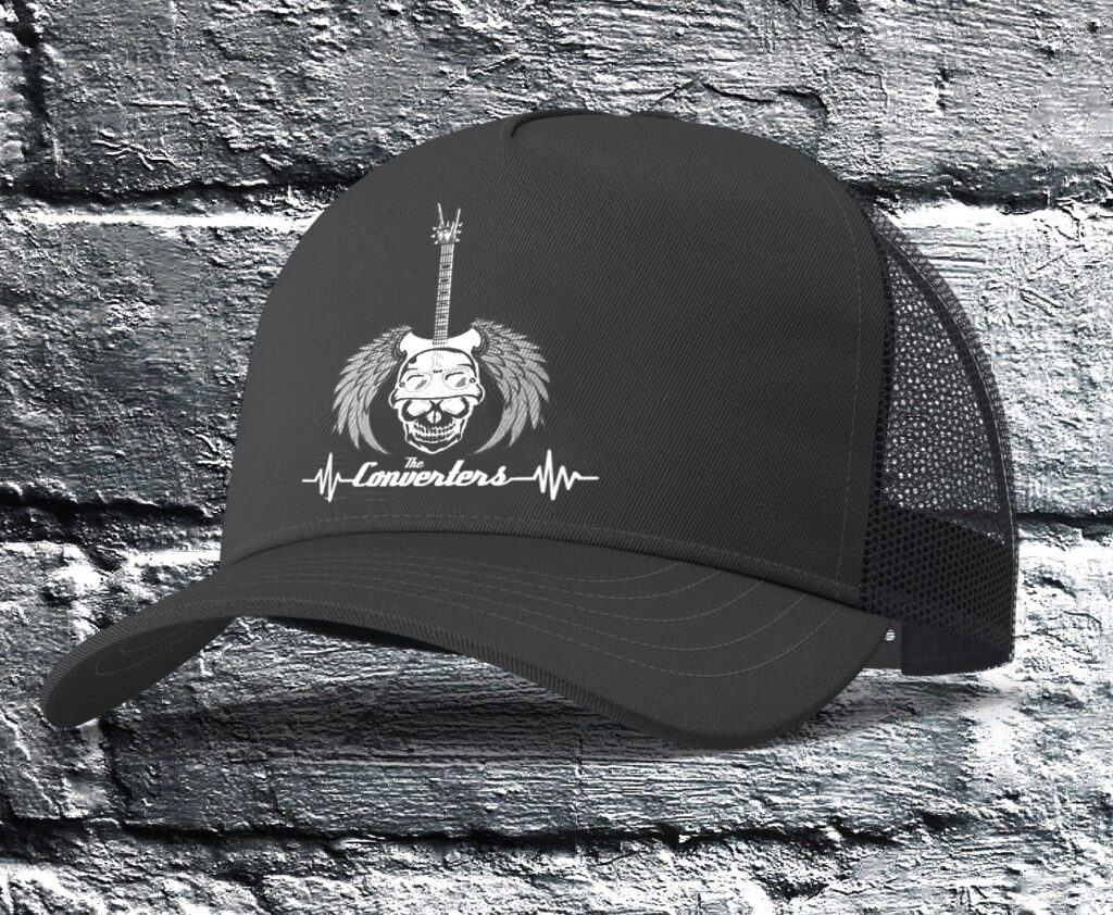
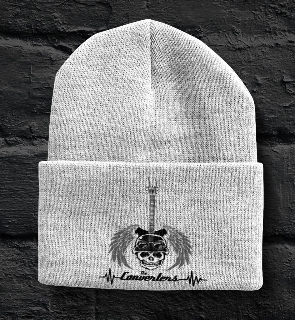
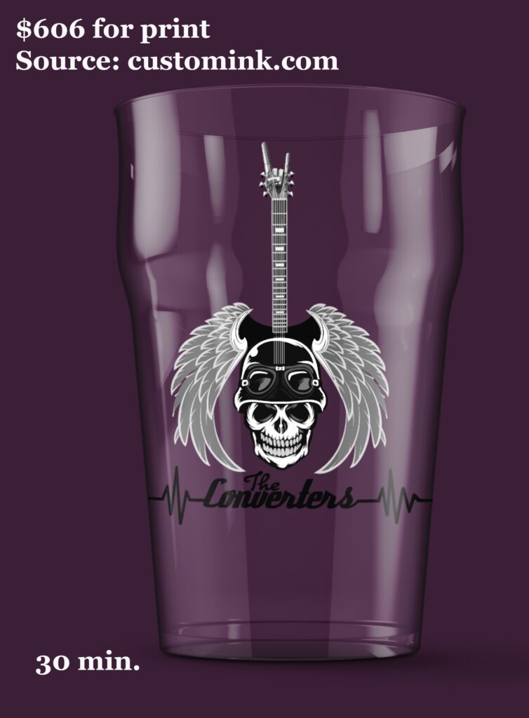
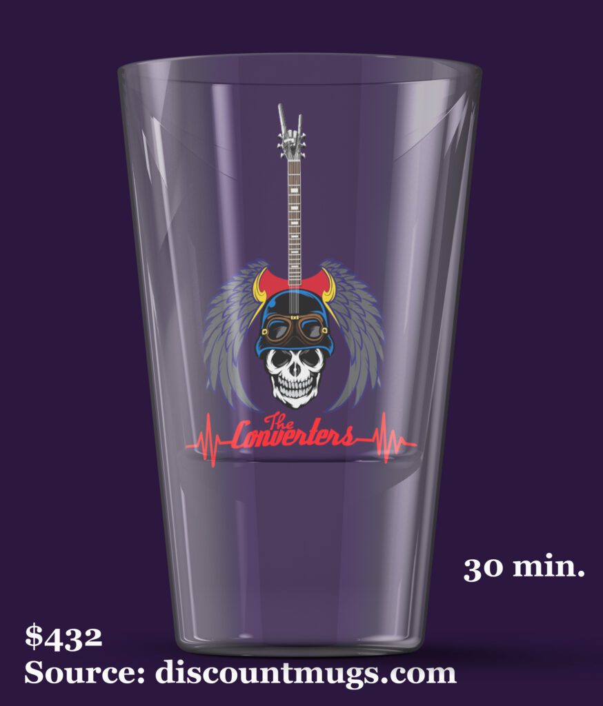
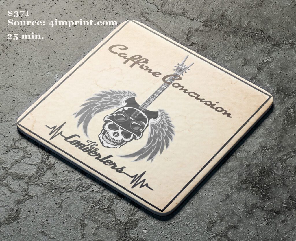
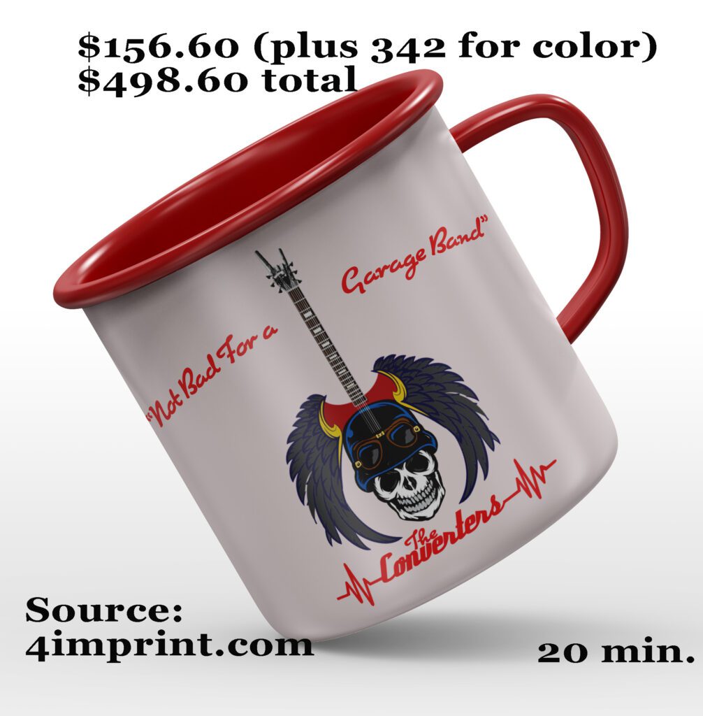
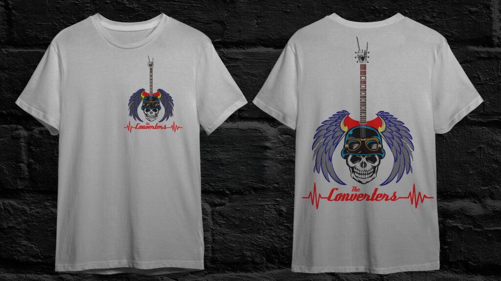
These are just some of the images that were created, but we could tell that the logo was working in both black and white and in color. There is more work to be done to get all of the final assets required for this project, but we know that we are in a good position moving forward. Included in some of the pictures are the time spent on the mockup and projected cost for print.
New Invoice for Revisions
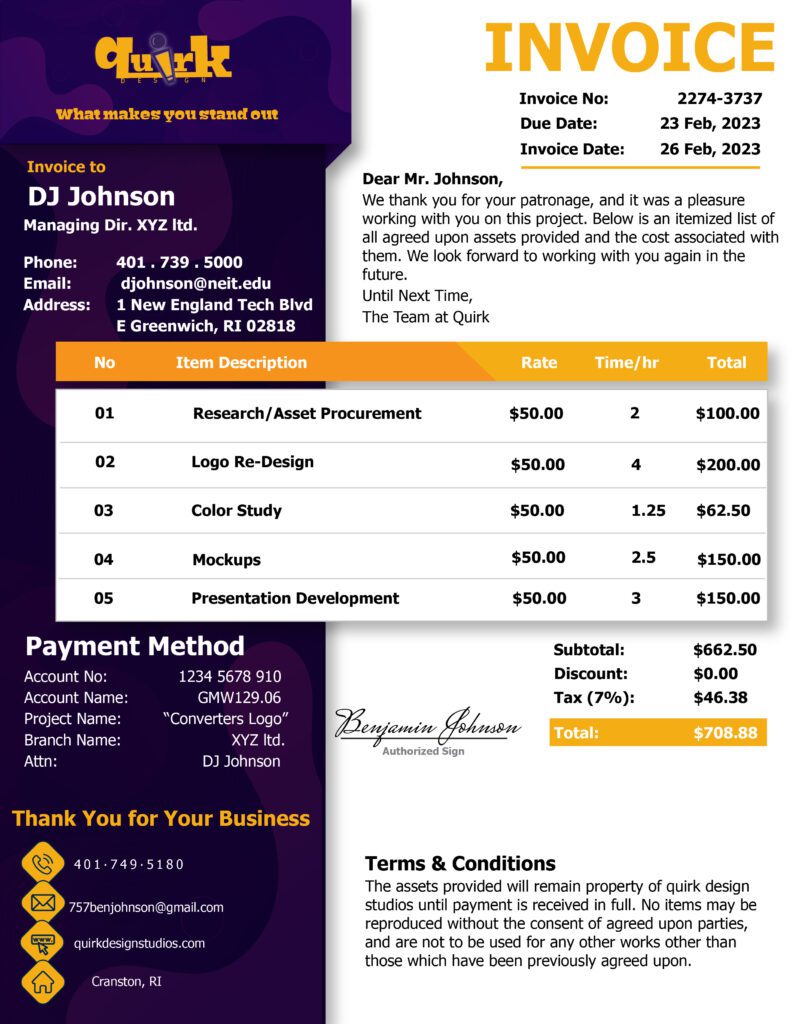
After completing the work done to this point there is a new and revised invoice. All the time has been accounted for for the revisions and the mockups, as well as, a presentation to be done at the request of the client.
