GMW Wayfinding
Graphics, Multimedia, and Web Design


Project Summary
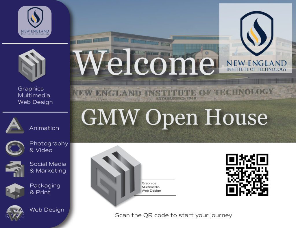
The goal of this project was to create a wayfinding experience from start to finish for a visitor to the New England institute of Technology who is interested in the Graphics, Multimedia, and Web Design program. The objectives were: to provide clear pathways for the visitor to follow, use iconography to clearly identify the different areas represented in the program, and limit choices to reach the final goal. The use of iconography was intended to be easily identifiable and graphically pleasing, without using too many words. Additionally, the visitor would be able to scan a QR code at the entryway kiosk to initiate an AR experience of a guided tour to the GMW suite.
Section 1: About the Client
What is the full name of the client brand?
New England Institute of Technology: Graphics, Multimedia, and Web Design department
What industry are they in, and what is their position within the industry?
They are a technical college located in Rhode Island
Who is the customer for this product?
New England Institute of Technology
Section 2: Their Challenge
The challenge is to produce three clear sketches that could be used as GMW wayfinding for campus signage. In addition to producing the iconography. I was challenged with creating an easy to follow experience for the first time visitor.
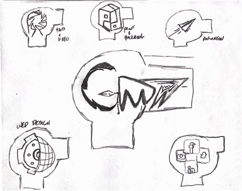

The above images were the original sketches I create to try to represent the GMW program.
Section 3: Your Solution
How did you approach the challenge?
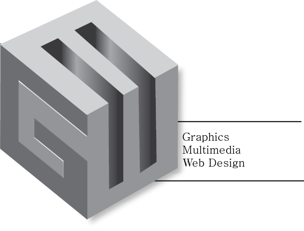
I approached the challenge by first trying to find a symbol that united the objects. That symbol is the circular shape that represents the “fishbowl” that makes up the GMW department. The images are seen in the above section. After some reworking, I decided that the images should have a more Graphic feel. I chose to make the images 3D and have the appearance of optical illusions. I felt that they were more suited to the program.
What was the solution?
The final solution was to take 3D renderings and manipulate them to suite the different programs.
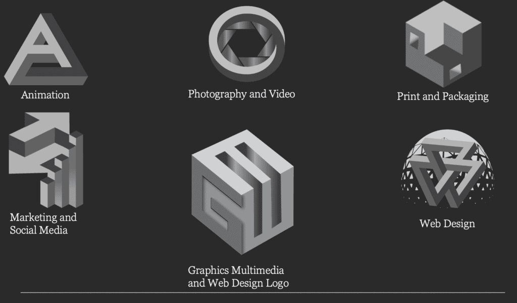

After I established the iconography, I had to create an experience for the first time visitor to be able to follow. The experience starts with the visitor entering for the first time.
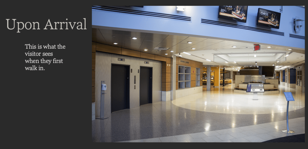

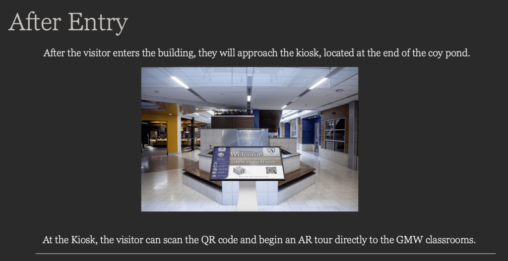

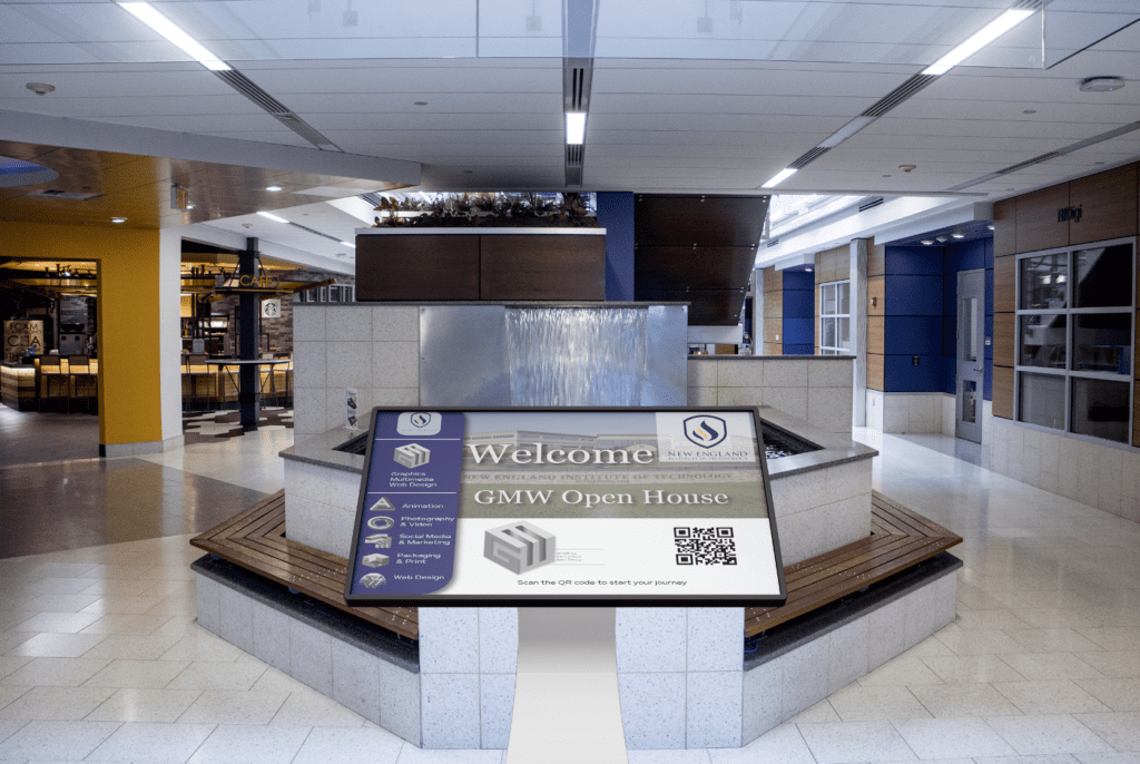

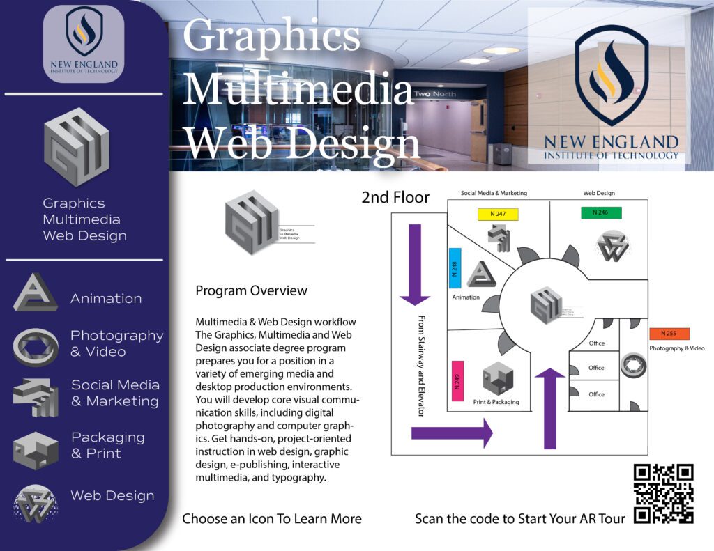
In addition to the one screen shown in the above image. I created an additional screen to further illustrate what the visitor experience would be like.
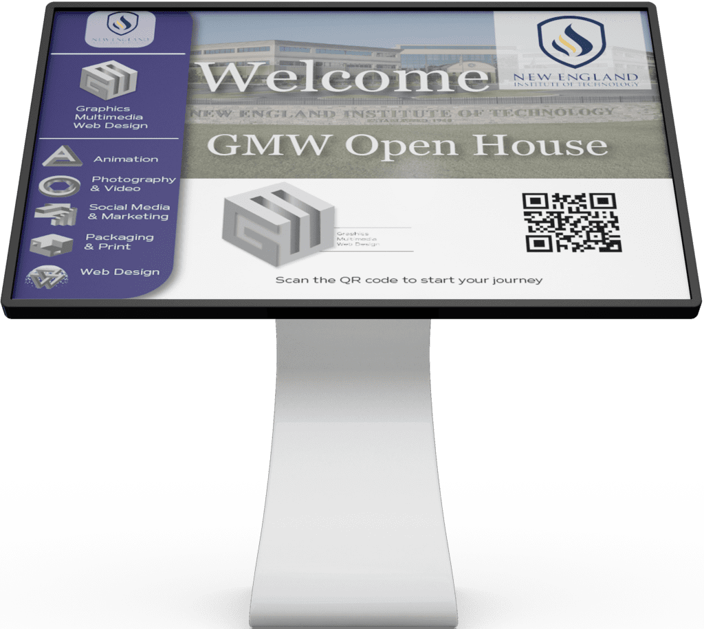

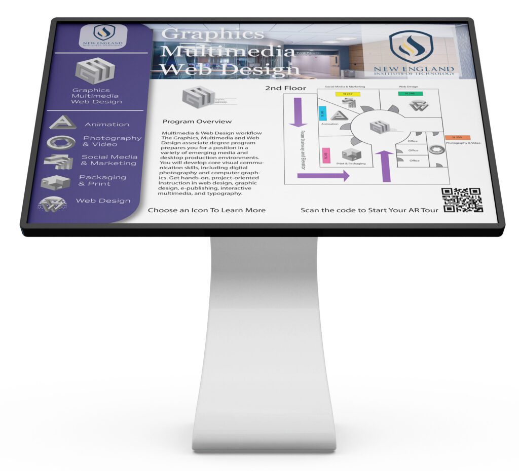

I wanted to give the visitor the option of being able to scan a QR code and begin a tour using their phone. I also wanted to include a graphic of the floor plan with the icons to help illustrate the locations of the classroom in the event that the visitor did not wish to scan the code. Below i have images that would appear in the visitor’s phone if they chose to take the AR tour, but also on the screen of the kiosk if that was the visitor’s preferred experience.
Waypoints
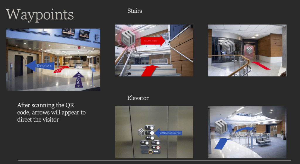

Once a selection has been made, the visitor will have access to these images which will guide them to the GMW suite. It also provides them with two options for the path they wish to take. The first option is the stairs, and the second option is to use the elevator.
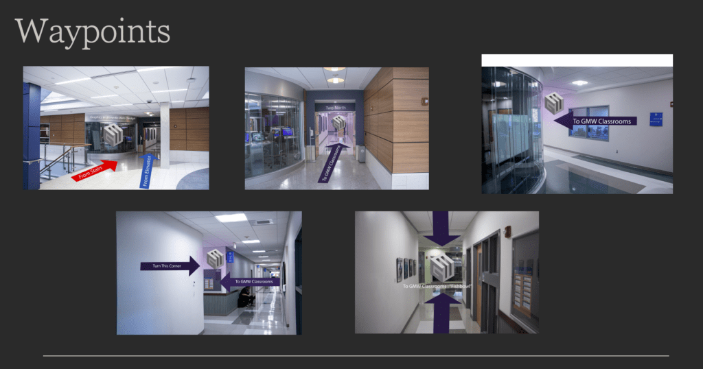

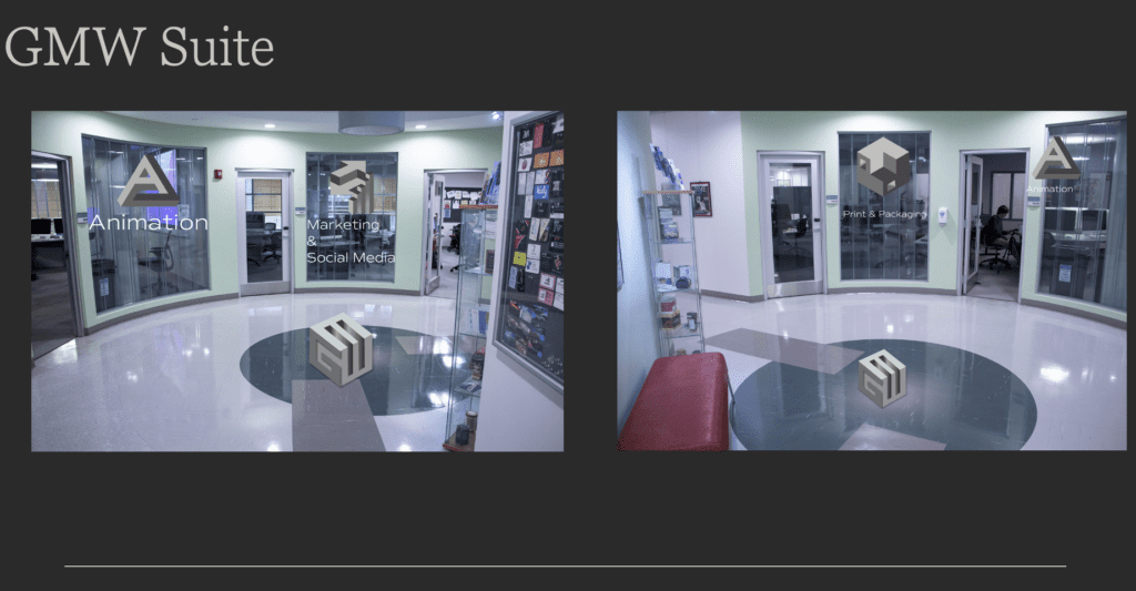

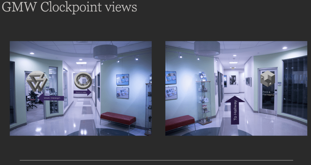

The above images show the visitor what they will be seeing once they reach the GMW suite, and if they chose to scan the code, they would have access to the information on the kiosk screen. They can select a program, and that room will light up in the floor plan, as well as, be highlighted in the AR mode. They can also access additional information about that specific program from their phone.
Kiosk Design
Here is a closer look at the kiosk design.


Timeframe
The time frame from start to finish for this project was about three weeks. I had to unify the concepts, and create the waypoints of the AR experience. The kiosk composites took around one day to complete. The project really came together after the iconography and way points were established. Once those were in place I was able to resolve most issues within a day.
